
Selecting paint colors can be one of the most challenging aspects of a painting project. With thousands of options available, many homeowners feel overwhelmed. Understanding some basic color theory can help you make confident choices that you'll love for years to come.
Understanding the Color Wheel
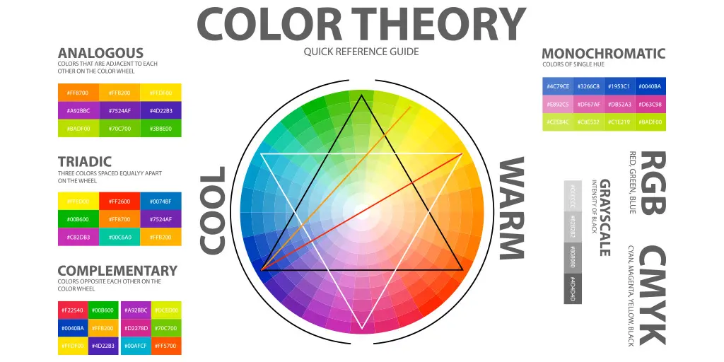
The color wheel is a valuable tool for understanding how colors relate to each other. It consists of primary colors (red, blue, yellow), secondary colors (green, orange, purple), and tertiary colors (those in between). Colors that are opposite each other on the wheel are complementary and create strong contrast, while colors adjacent to each other are analogous and create harmony.
Warm vs. Cool Colors
Colors are generally categorized as either warm or cool. Warm colors (reds, oranges, yellows) tend to energize a space and make it feel cozier, while cool colors (blues, greens, purples) create a calm, relaxing atmosphere and can make a space feel larger. Consider the function of the room and the mood you want to create when deciding between warm and cool tones.
Understanding Undertones
Every color has undertones that might not be immediately obvious. For example, a gray might have blue, green, or purple undertones. These undertones become more apparent once the color is on your wall and can clash with existing elements if not carefully considered. To identify undertones, compare similar colors side by side—the undertones will become more apparent in contrast.
Consider Your Existing Elements
Your paint color should complement your existing furniture, flooring, and fixtures. Bring home paint samples and view them against these elements in different lighting conditions. If you're starting from scratch, consider creating a mood board with all your design elements to ensure a cohesive look.
The Impact of Lighting
Light dramatically affects how we perceive color. Natural north-facing light tends to bring out blue and green undertones, while south-facing light enhances warm tones. East-facing rooms get warm morning light and cooler afternoon light, while west-facing rooms experience the opposite. Artificial lighting also impacts color—incandescent bulbs enhance warm tones, while LED and fluorescent lighting can make colors appear cooler.
Testing Colors Properly
Never choose a color based solely on how it looks on a small paint chip. Instead, purchase sample pots of your top choices and paint large swatches (at least 2' x 2') on multiple walls. Observe these swatches at different times of day and in various lighting conditions before making your final decision.
Creating Flow Between Rooms
For a cohesive home, consider how colors will flow from one room to another, especially in open-concept spaces. You don't need to use the same color throughout, but colors should complement each other. One approach is to select colors from the same color strip on a paint deck, using lighter shades for some rooms and darker for others.
The 60-30-10 Rule
Professional designers often use the 60-30-10 rule: 60% of the room is the dominant color (usually walls), 30% is the secondary color (furniture, large accents), and 10% is the accent color (accessories, artwork). This creates a balanced, visually interesting space without overwhelming the senses.
Remember, there are no absolute right or wrong choices when it comes to color—what matters most is how the colors make you feel in your space. Take your time with the selection process, and don't be afraid to seek professional advice if you're still uncertain.